- Explainers
- Explainer video styles
- Abstract product UI
Explainer video style · Abstract product UI
Product UI animation explainer videos
Clean interface motion: windows, cards, charts and a cursor. Brief it in one sentence and get a narrated, animated explainer film in the Abstract product UI style, scored and voiced, in about 15 minutes.
Or let the director choose a style for your topic.
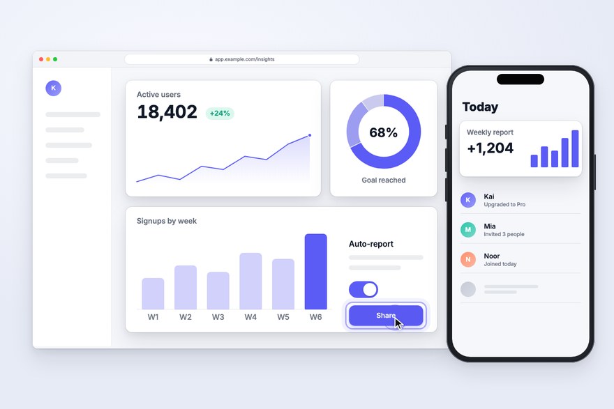
What it looks like, and when to use it.
Clean app windows, cards, toggles and charts on a soft light canvas, with a cursor that glides in and clicks. Abstract product UI is drawn in code, so every line stays crisp and every number can be real. It suggests software without copying anyone’s interface, and your own screenshots and screen recordings sit in the same device frames.
Best for
- SaaS and app launches
- Feature walkthroughs and onboarding
- Release notes and changelogs
Try a brief like
- “What our new dashboard does in 60 seconds”
- “How two-factor sign-in protects you”
- “Setting up your first automation”
The art direction the director follows.
Every style is a full art direction, not a filter: its own palette, type, motion and music. This is the brief the director works from for Abstract product UI.
- Look
- Drawn in code, no generated images: premium software-marketing motion design — simplified, abstract app interfaces (windows, cards, list rows, toggles, buttons, charts, skeleton text bars, avatar dots) on a soft light canvas, crisp 1px hairlines, generous spacing, rounded corners, soft layered shadows, one confident accent colour (the brand's) and tidy sans-serif type. It suggests software without pretending to be a specific real product; the user's real screenshots, when given, sit in the same device frames.
- Motion
- Product-film choreography: cards rise and settle on soft springs, a cursor glides in eased arcs and clicks with a ripple, toggles flip, numbers count up, charts grow and text types on; the camera zooms into the one region that matters, holds while it is read, then pulls back to the whole screen.
- Music
- Bright modern tech underscore: clean plucks, soft synth pads, a light broken beat — optimistic and confident, lifting at the payoff.
- Type
- One clean UI sans (Inter-like) in 2–3 weights: big headlines outside the interface, small tabular figures inside it.
25 more styles. Or let the director choose.

Editorial collage

Risograph print

16-bit pixel art
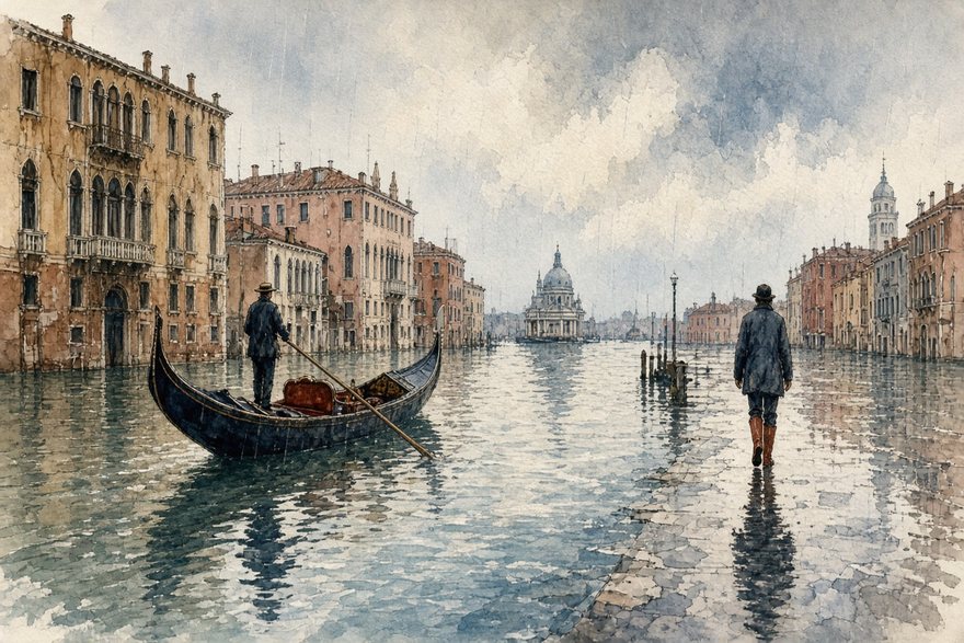
Watercolor editorial
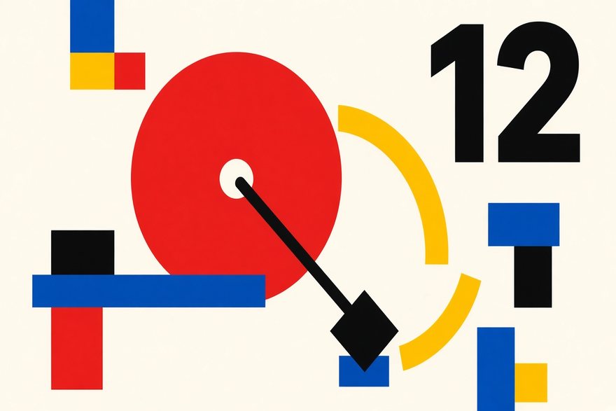
Swiss modernist
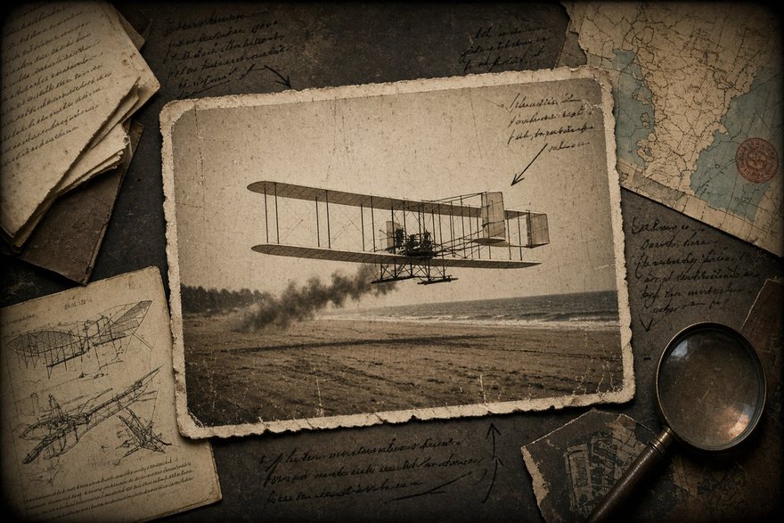
Archival documentary

Claymation look
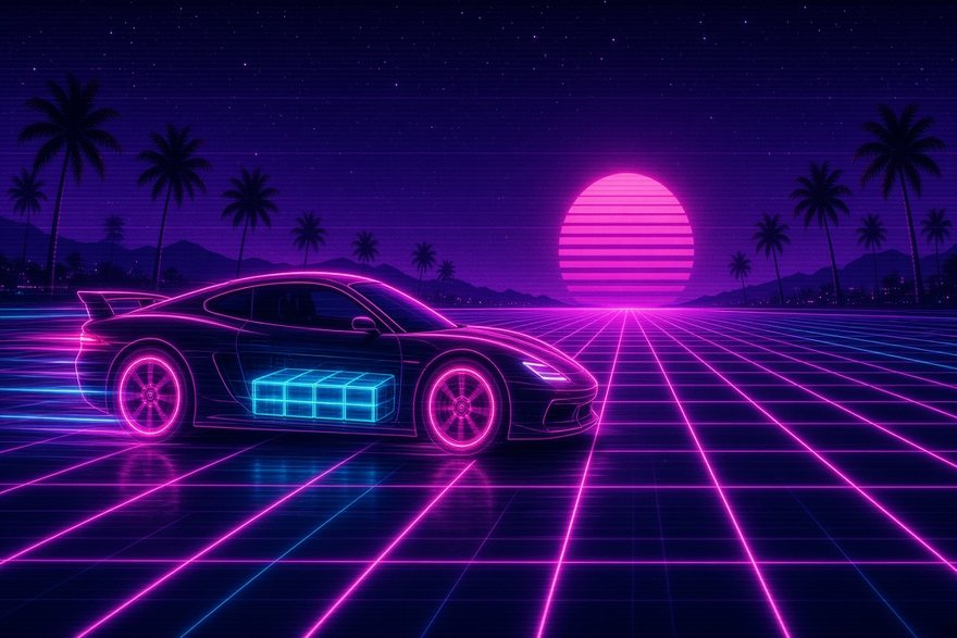
Neon synthwave
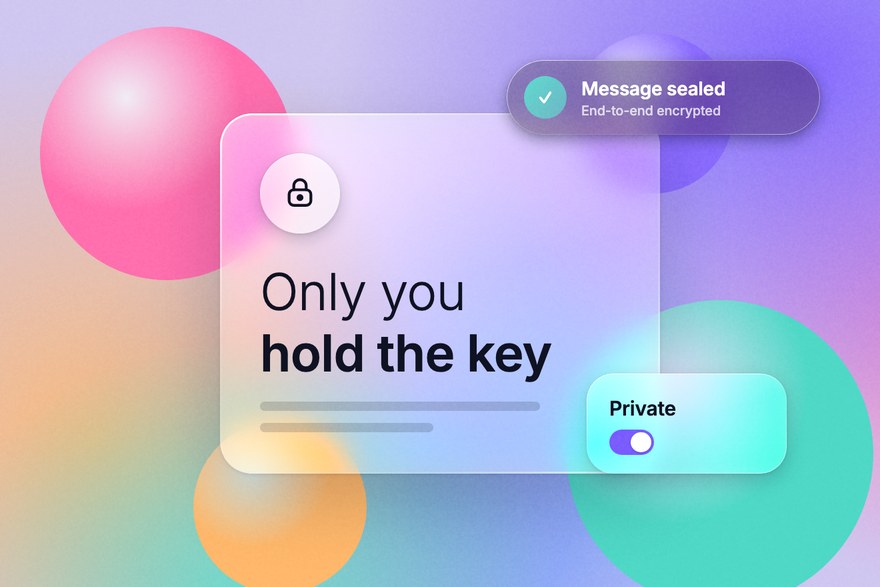
Liquid glass

Ukiyo-e woodblock
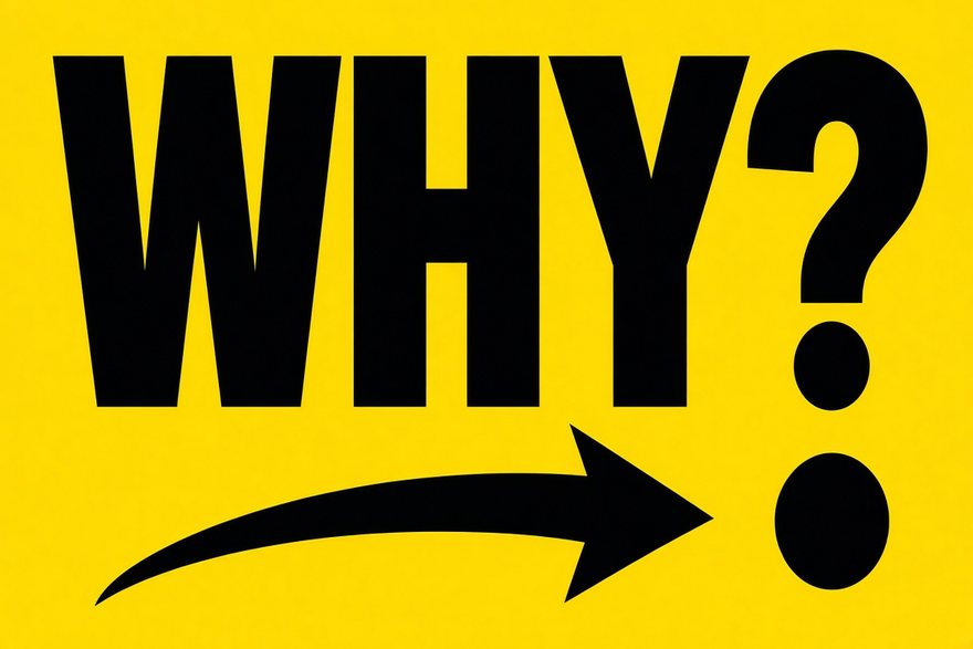
Kinetic typography

Felt & yarn craft
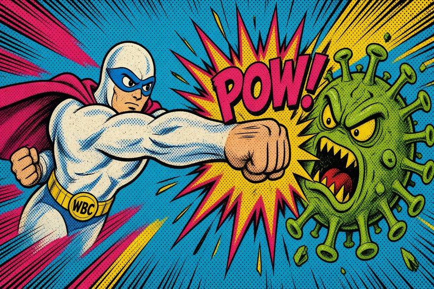
Pop comic book
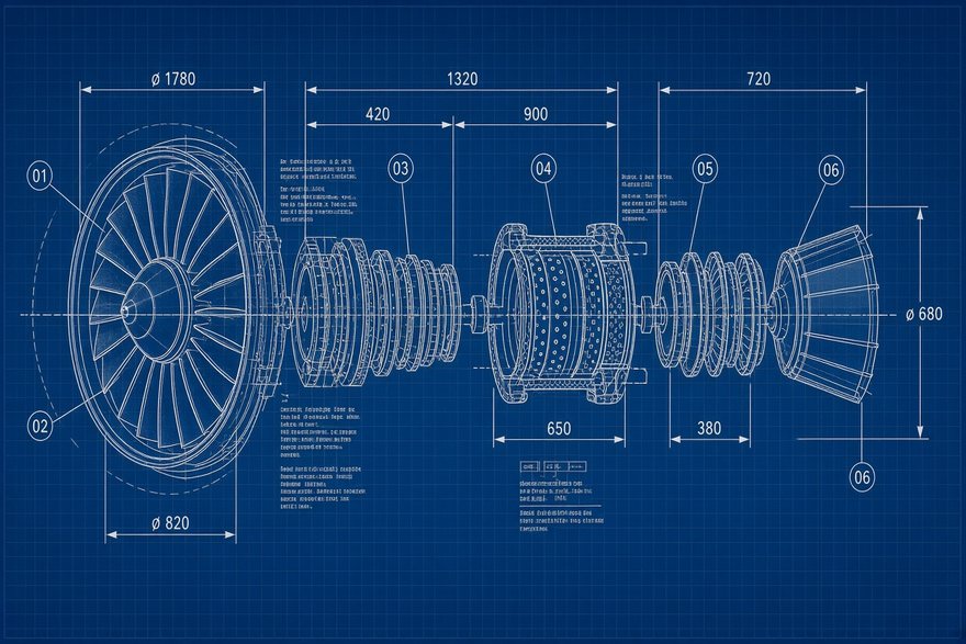
Blueprint / technical
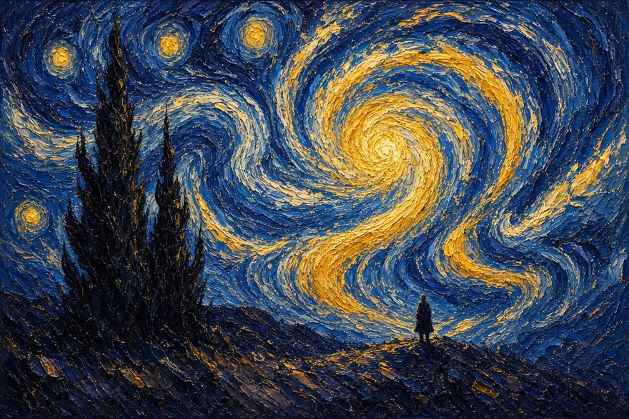
Oil impasto

Isometric low-poly
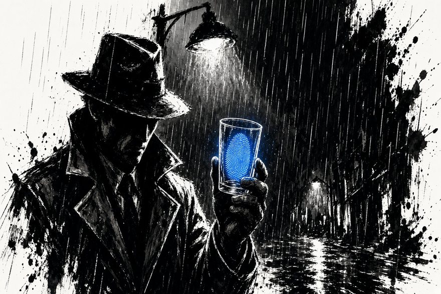
Ink noir + one colour
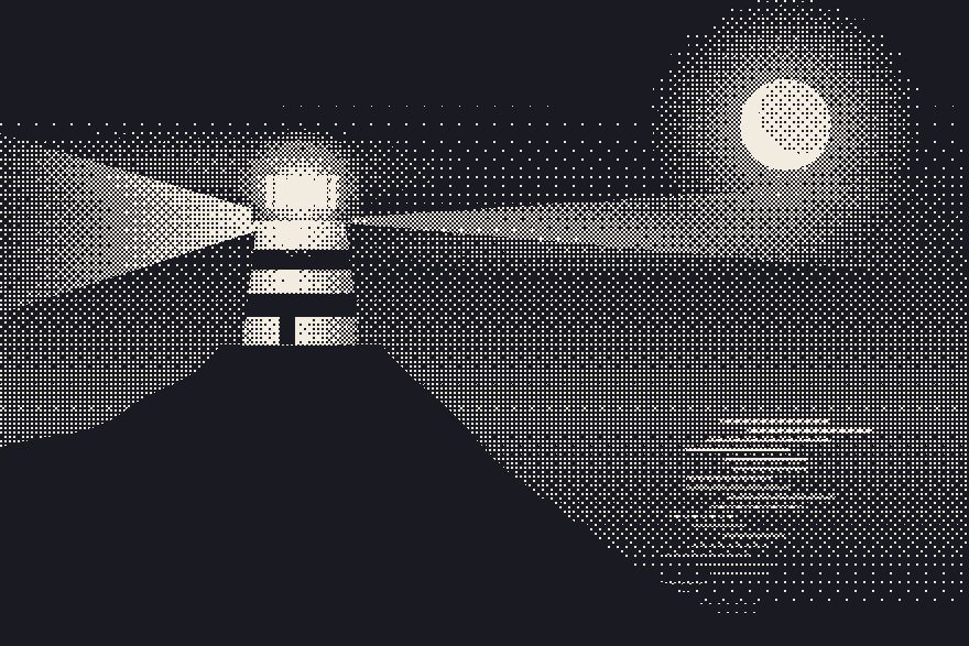
Dithered 1-bit

Layered papercut
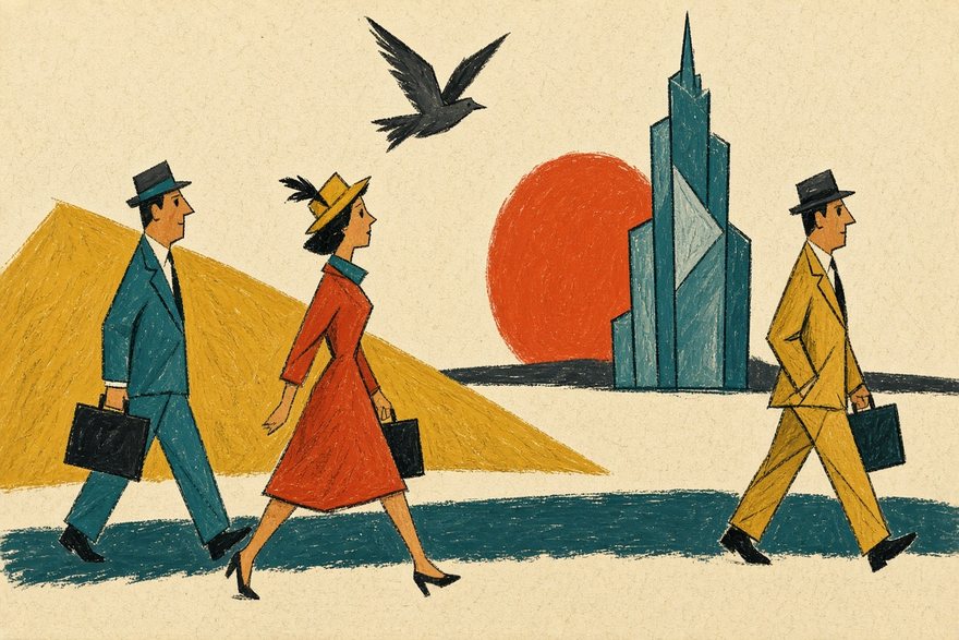
Mid-century cartoon
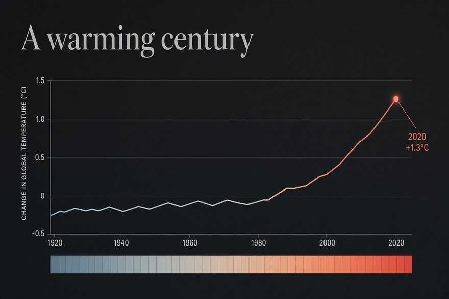
Data-journalism dark
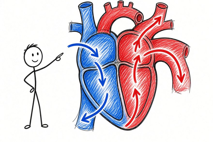
Whiteboard doodle

Nature documentary

Bold flat vector
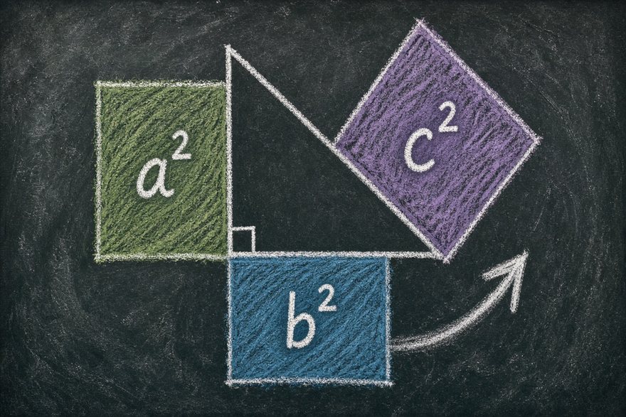
Chalkboard lesson
One sentence is enough.
Describe your topic, approve the storyboard, and get a narrated, animated film in about 15 minutes. Explainers is invite-only for now: sign in and tell us what you want to explain.
Make an explainer in this style