- Explainers
- Explainer video styles
- Kinetic typography
Explainer video style · Kinetic typography
Kinetic typography videos
Words are the visuals — bold, rhythmic, minimal. Brief it in one sentence and get a narrated, animated explainer film in the Kinetic typography style, scored and voiced, in about 15 minutes.
Or let the director choose a style for your topic.
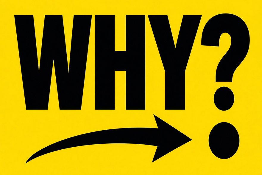
What it looks like, and when to use it.
The words are the visuals. Bold type on flat colour fields, with simple symbols, arrows and counters, all drawn in code and cut to the beat of the score. Kinetic typography is the quickest way to make a message stick, and it is the style Explainers used for its own promo.
Best for
- Product promos and launches
- Quotes, manifestos and announcements
- Social cut-downs in 9:16 and 1:1
Try a brief like
- “Make a promotional video for this app”
- “Our three company values”
- “What changes in version 2”
The art direction the director follows.
Every style is a full art direction, not a filter: its own palette, type, motion and music. This is the brief the director works from for Kinetic typography.
- Look
- Drawn in code, no generated images: bold typography on flat colour fields, plus simple geometric symbols, rules, arrows and counters built from CSS/SVG shapes.
- Motion
- Kinetic type synced word-by-word to narration: words slam, slide, scale and rotate on beat, masks and split-letter reveals, bold colour flips between sections.
- Music
- Driving modern minimal beat: plucks, sub pulses, crisp percussion, builds on key lines.
- Type
- Heavy grotesk display + elegant serif accents, huge sizes.
Films made in Kinetic typography.
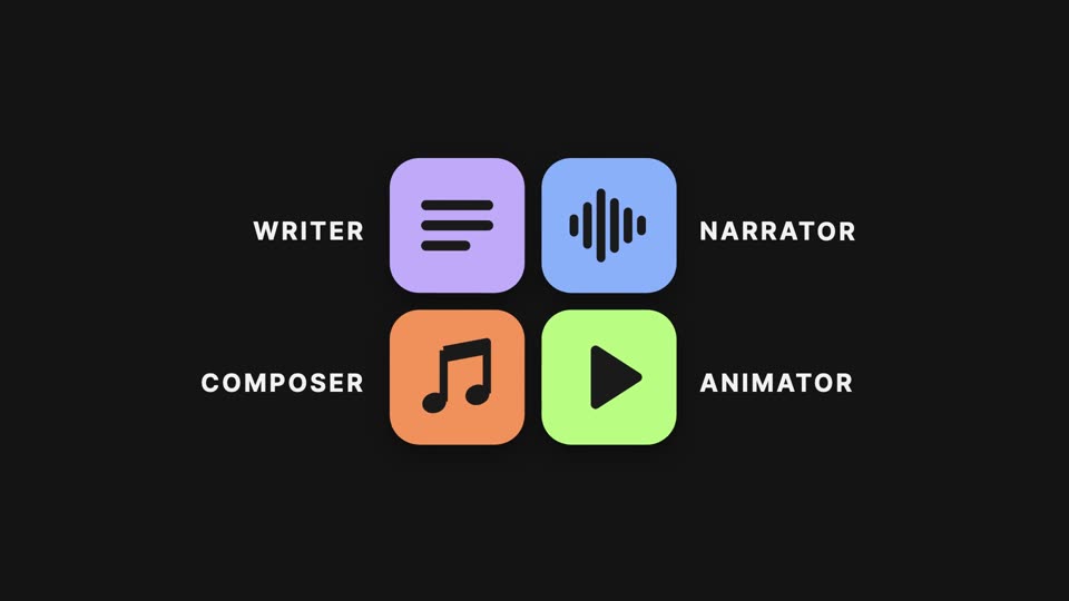
22 more styles. Or let the director choose.

Editorial collage
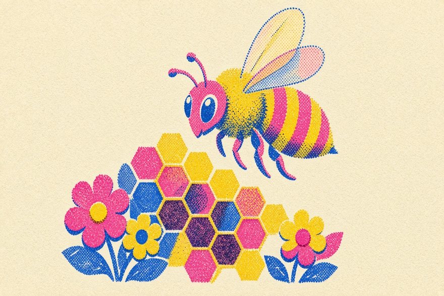
Risograph print

16-bit pixel art
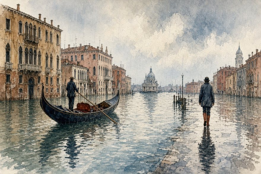
Watercolor editorial
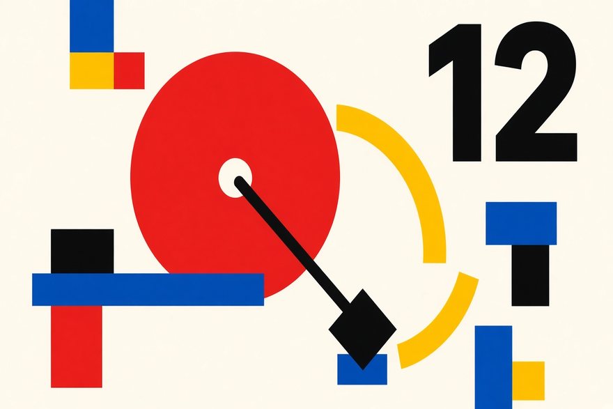
Swiss modernist
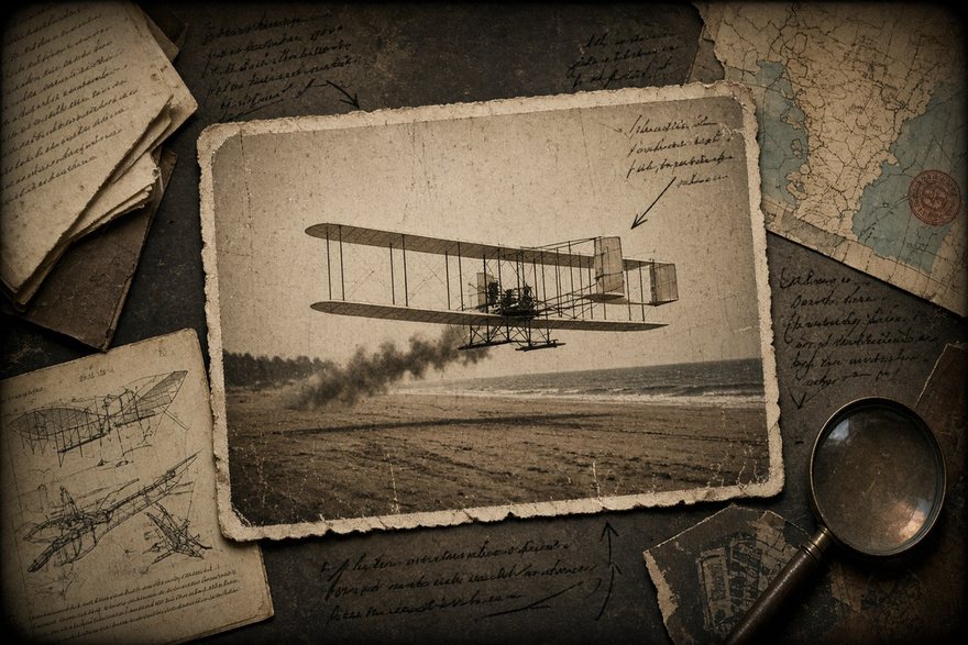
Archival documentary

Claymation look

Neon synthwave
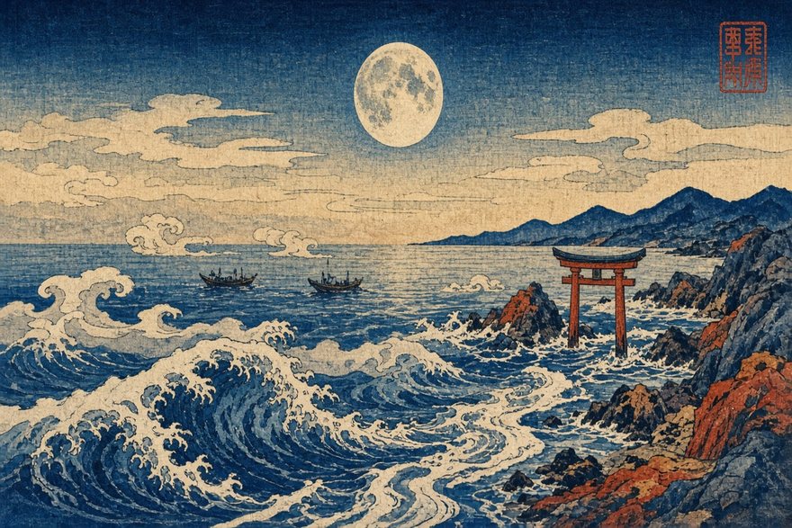
Ukiyo-e woodblock

Felt & yarn craft
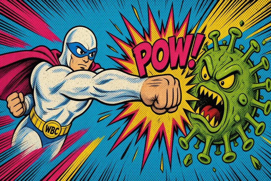
Pop comic book

Blueprint / technical
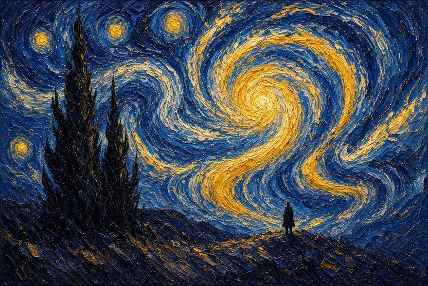
Oil impasto
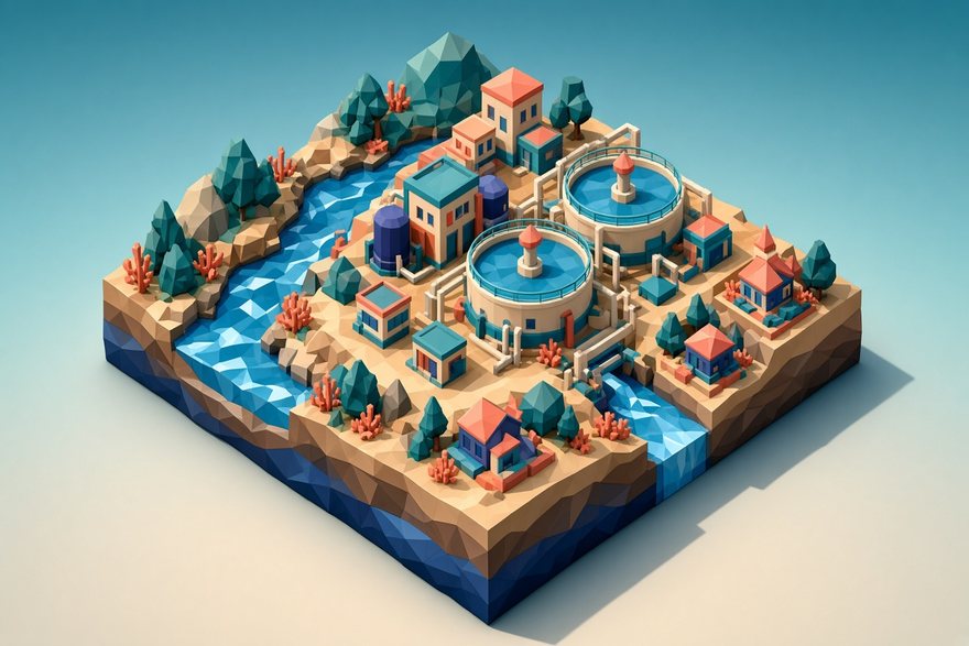
Isometric low-poly
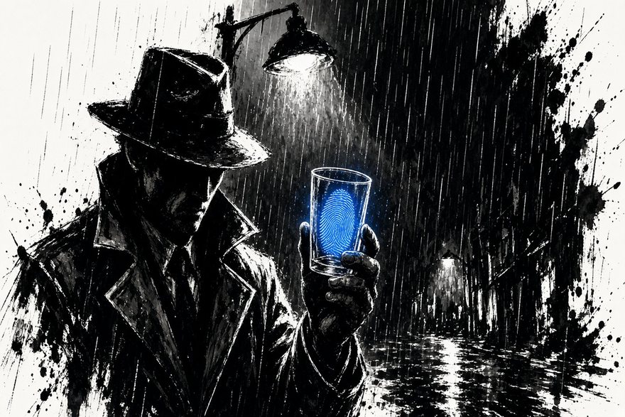
Ink noir + one colour
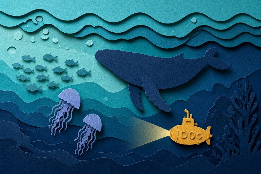
Layered papercut
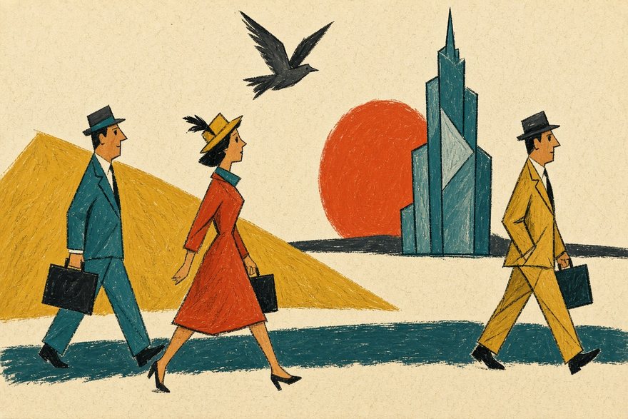
Mid-century cartoon
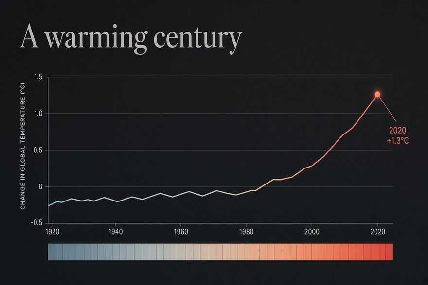
Data-journalism dark
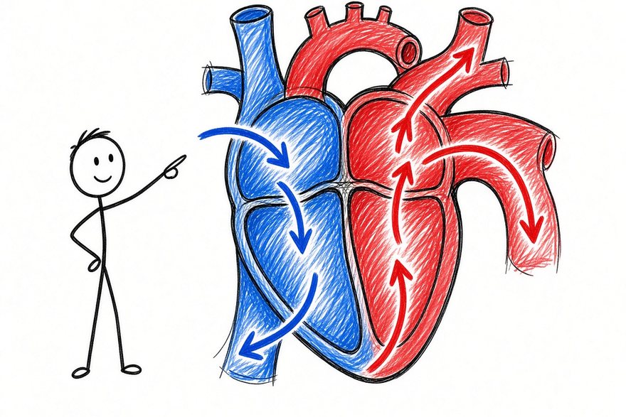
Whiteboard doodle
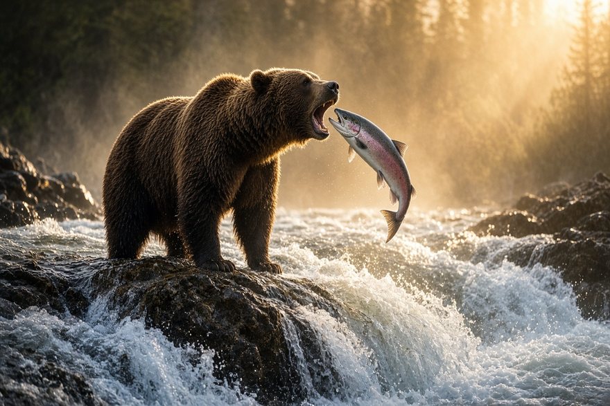
Nature documentary

Bold flat vector
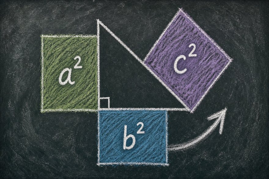
Chalkboard lesson
One sentence is enough.
Describe your topic, approve the storyboard, and get a narrated, animated film in about 15 minutes. Explainers is invite-only for now: sign in and tell us what you want to explain.
Make an explainer in this style